.svg)
.svg)


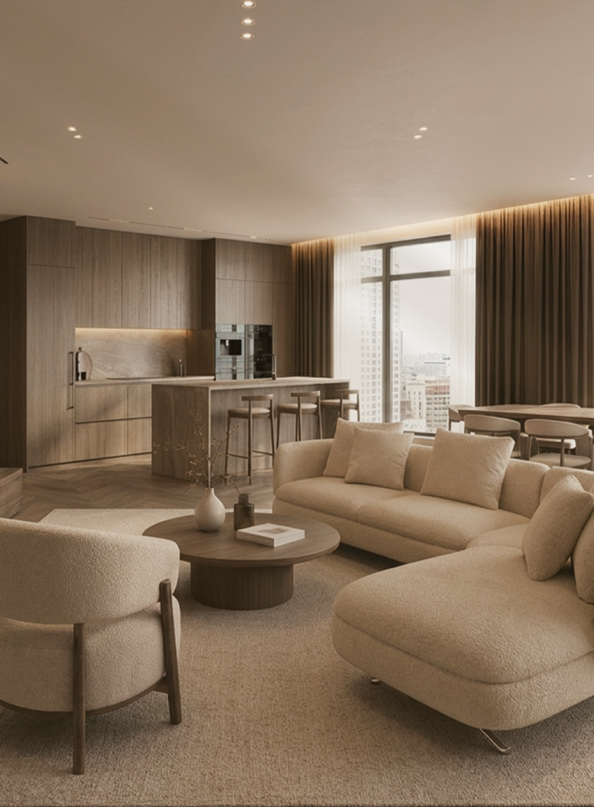


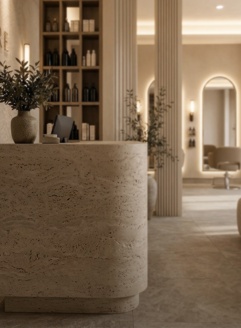

I walked into a client’s stunning colonial home last month, with its soaring ceilings and beautiful original proportions, and felt my heart sink. Every surface was beige. Beige walls, beige sofas, beige carpets, beige curtains. It was like stepping into a sepia photograph: beautiful, but utterly lifeless.
After years of designing homes around the people who live in them, I have come to recognise the signs of what I call “beige paralysis”. It is the safe, neutral territory homeowners retreat to when they are afraid of making the wrong choice. Yet playing it safe can be the riskiest design decision of all.
Beige is not just a colour. It can become a mindset. And when every choice is guided by caution, a home loses the opportunity to feel truly personal.
THE GREAT BEIGE EPIDEMIC
Don’t misunderstand me. I’m not advocating for rainbow walls or circus-themed living rooms. There is absolutely a place for neutral palettes in sophisticated design. But the beige I’m talking about isn’t sophisticated neutrality. It’s design by default. It’s the colour equivalent of ordering vanilla ice cream every time you visit a gelato shop with fifty exotic flavours.
The beige epidemic began in the early 2000s, when “resale value” became the driving force behind every design decision. Homeowners were told that bold choices would alienate future buyers and that playing it safe was playing it smart. The result? An entire generation of homes that look like they were designed by committee: pleasant enough, but devoid of personality.
But here’s the irony: the most memorable and valuable homes are the ones with distinct character. They’re the properties that buyers remember long after viewing dozens of beige boxes.
WHY WE CLING TO BEIGE
I understand the appeal. Beige feels safe because it’s inoffensive. It won’t clash with your grandmother’s furniture or that artwork you bought on holiday. It creates a blank canvas that, in theory, allows other elements to shine.
But that’s exactly the problem. A blank canvas is only valuable if you’re planning to paint on it. Most beige rooms stay blank forever, creating spaces that feel more like waiting rooms than homes.
There’s also the fear factor. Colour requires commitment, and commitment requires confidence. It’s easier to choose beige than to risk choosing the wrong colour. But what we perceive as “wrong” is often simply different from what we expected, and different can be extraordinary.
WHAT SOPHISTICATED NEUTRALS ACTUALLY LOOK LIKE
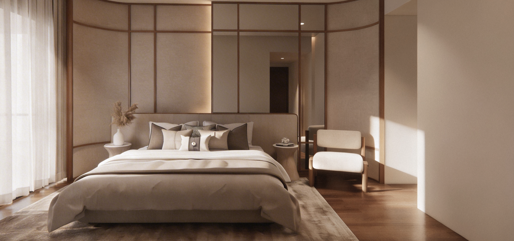
True neutral sophistication isn’t about avoiding colour. It comes from understanding the subtle complexities within seemingly simple palettes. The most elegant neutral rooms I’ve designed use what I call “complex neutrals”: colours that shift throughout the day, revealing different qualities as the light changes.
A warm grey with lavender undertones can feel serene in the morning and sophisticated at dusk. A soft putty with hints of gold may glow in the afternoon sun, while a cream with the faintest whisper of peach can make skin look luminous and a space feel more embracing.
These aren’t beige. They’re neutrals chosen with intention and given soul.
THE POWER OF PURPOSEFUL COLOUR
The colours within a room can reveal something about who you are, how you live and what you value. A deep navy dining room may suggest an appreciation for drama and intimacy. Sage green might reflect a sense of peace found in nature, while rich terracotta brings warmth and creativity to a space.
When clients tell me they “don’t know what colours they like”, it often means they haven’t yet given themselves permission to have preferences. Colour is deeply personal, and discovering your own palette can open up an entirely new way of expressing yourself.
BEYOND THE BEIGE BOX: BUILDING COLOUR CONFIDENCE
If you’re ready to move beyond beige but don’t know where to start, begin with what already inspires you. Look at your wardrobe. The colours you enjoy wearing often translate beautifully into your living spaces. Notice the photographs you’re drawn to, the restaurants where you feel most comfortable and the hotel rooms where you sleep best.
Start small. Paint a powder room in the dusty blue you love but have been too afraid to try. Add cushions in rich burgundy or forest green. Introduce artwork that makes you smile, regardless of whether it “matches” everything else.
THE SOPHISTICATED ALTERNATIVE TO SAFE
Sophisticated use of colour begins with intention. You might choose a soft, muted sage because it reminds you of your grandmother’s garden, rather than because it happens to be trending. You might paint your bedroom the colour of dawn simply because it brings you a sense of peace, not because a magazine claims it will improve your sleep.
The most successful rooms I design have what I call “colour confidence”: a clear point of view shaped by choices that feel personal and polished. The palette may consist of only two or three colours, but each one has a reason for being there.

COLOUR AS INVESTMENT, NOT RISK
Here's a truth the beige advocates won't tell you: the right colours actually increase the value of your home. Not because they appeal to everyone, but because they create memorable, distinctive spaces that stand out in buyers' minds.
I’ve seen bold choices, such as a dramatic black powder room, a library painted in deep forest green or a kitchen with stunning blue cabinets, become the selling points that close deals. These rooms have personality, and personality is what transforms a house from a commodity into a home.
THE BEIGE TEST
Ask yourself: when you walk into your home, do you feel energised and inspired, or do you feel nothing at all? Do your rooms reflect your passions, your travels and your story, or could they belong to anyone?
If your home could appear in a stock photo catalogue, you may still be living in the age of beige, even if your palette consists of grey, white or cream. The problem isn't the specific colour; it's the lack of intention behind the choice.
YOUR PERSONAL COLOUR REVOLUTION
Moving beyond beige doesn’t require a complete renovation or an unlimited budget. Sometimes, it begins with giving yourself permission to have preferences, make choices that feel true to you and create spaces for the life you live, rather than for a hypothetical future buyer.
Start with one room, one wall or one piece of furniture. Choose something because it speaks to you, not because it's safe. Notice how different you feel in that transformed space. I guarantee you'll wonder why you waited so long.
The age of beige was about playing it safe in an uncertain world. But we're no longer in that world. We're in an age where authenticity is valued over conformity, where personal expression is celebrated over bland uniformity.
Your home should be the most personal space you inhabit. It should reflect your journey, your joys, your unique way of seeing the world. It should feel like coming home, not checking into a generic hotel.
So I ask you again: Are you still living in the age of beige? And if so, isn't it time to write a new chapter?
Discover your authentic colour palette and create spaces that truly reflect who you are. Whether you are designing a landed home or condominium, DreamR can help you move beyond safe choices and create an interior with genuine personality and sophisticated colour confidence.
Book a private consultation to begin your personal colour revolution.
FREQUENTLY ASKED QUESTIONS
HOW DO I CHOOSE THE RIGHT COLOUR PALETTE FOR MY HOME?
Begin with colours you naturally respond to in your wardrobe, artwork or favourite places. Then consider how each shade appears under the natural and artificial light in your home. A well-designed palette should feel personal while remaining cohesive across the space.
HOW CAN I ADD COLOUR WITHOUT OVERWHELMING A NEUTRAL INTERIOR?
Start with smaller elements such as cushions, artwork, rugs or a single painted wall. Muted shades of sage, terracotta, burgundy or blue can introduce depth while preserving the calm quality of a neutral interior.
CAN A NEUTRAL INTERIOR STILL HAVE PERSONALITY?
Yes. Personality can come through subtle undertones, contrasting materials, layered textures and carefully chosen accent colours. The key is to select every element with intention rather than relying on beige, white or grey by default.


.svg)