.svg)
.svg)


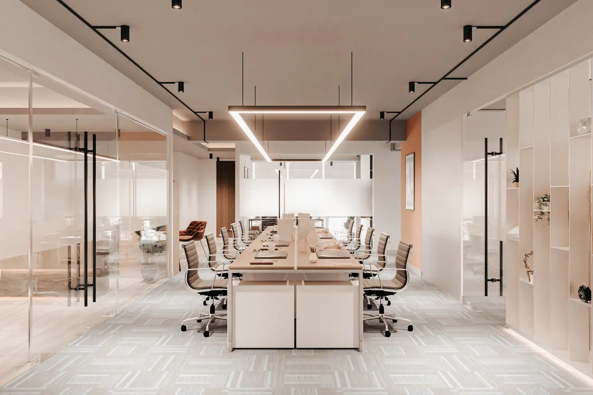
Walk into any truly successful office, and you'll immediately sense something different about the energy. The space feels intentional, purposeful—and more often than not, this feeling starts with color.
While most business owners focus on furniture and layout, the colors surrounding your team are quietly influencing everything from productivity levels to creative thinking to stress management. The most effective office color schemes work behind the scenes, creating environments where employees feel energized, focused, and motivated.
Why Color Matters in Your Office
Research shows that color directly impacts how our brains work. Different colors affect our heart rate, attention span, and even our ability to think creatively. This means you can actually use color strategically to support your business goals and help your team perform better.
Blue enhances focus. Red increases energy. Green reduces stress. When you understand these effects, you can create work environments that actively help your team succeed.
Blue: The Focus Enhancer
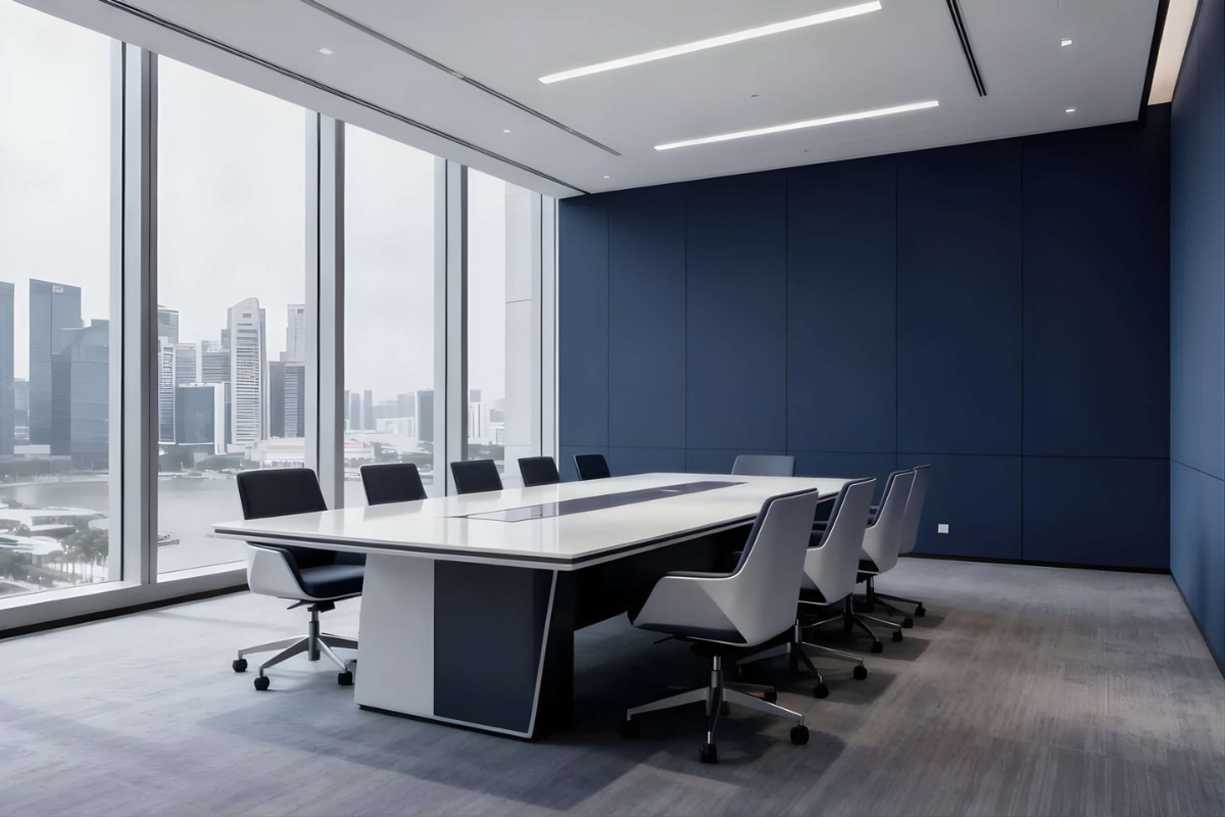
Blue is proven to enhance concentration and analytical thinking. People perform better on detail-oriented tasks in blue environments, making it one of the most valuable colors for office spaces.
Best for these spaces:
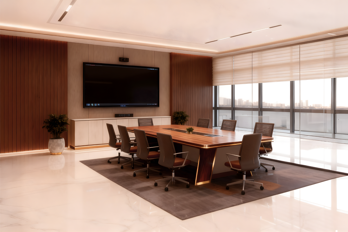
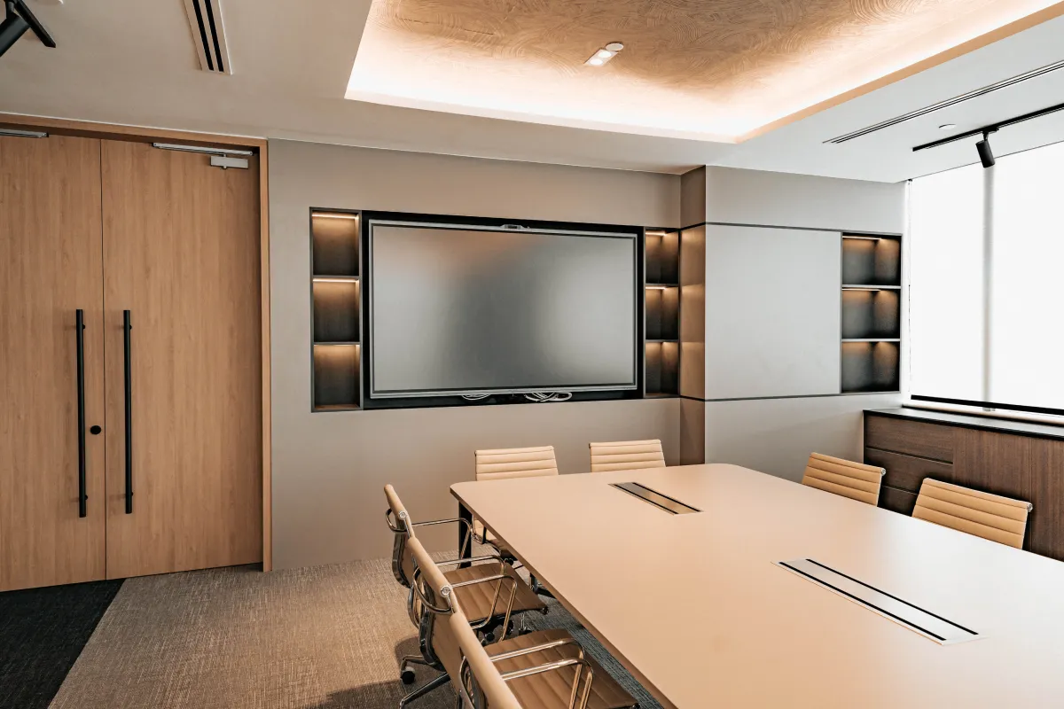
- Conference rooms where important decisions are made
- Accounting and finance departments
- Reception areas to project competence and trust
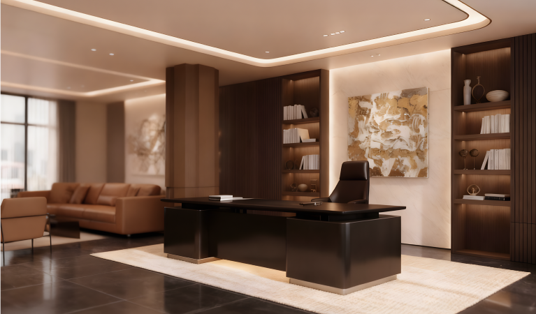
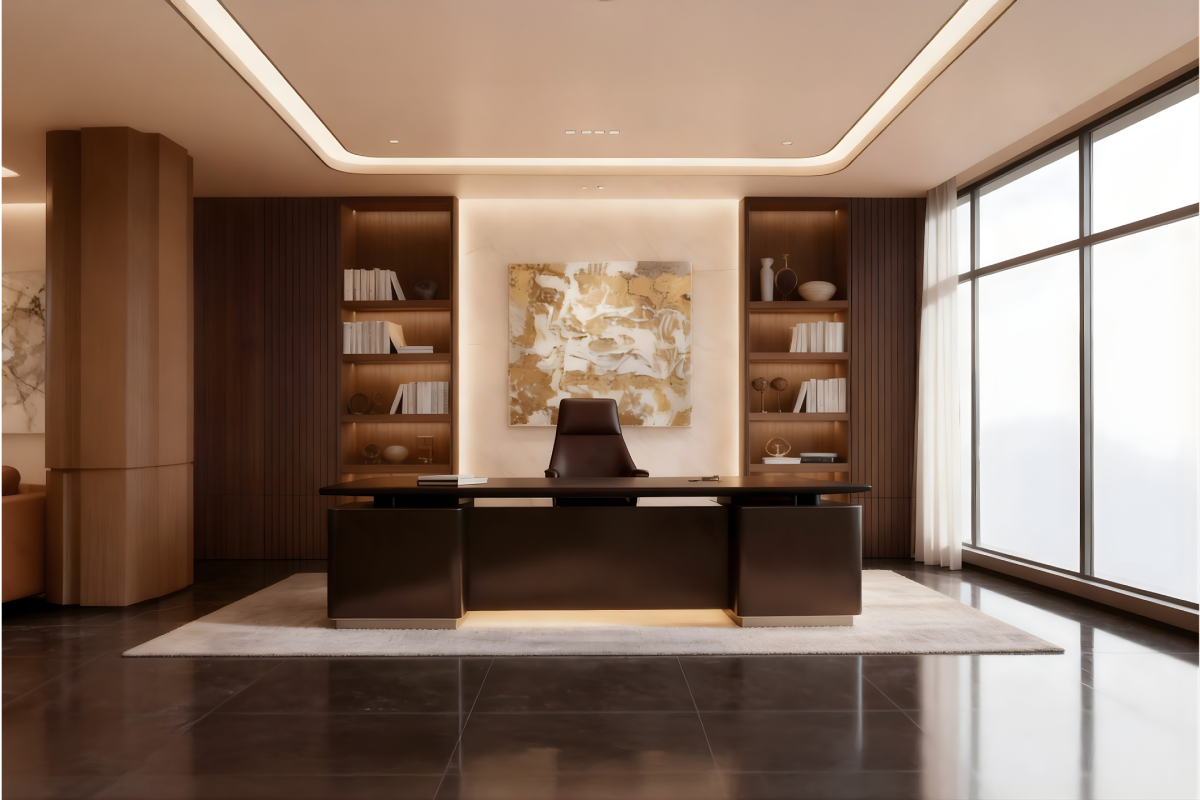
- Executive offices to convey authority
- Any workspace requiring sustained concentration
How to use it: Light blues create calm, focused energy. Navy blues convey authority and trustworthiness. Use blue as accent walls rather than painting entire rooms—too much blue can feel cold or impersonal.
Green: The Stress Reducer
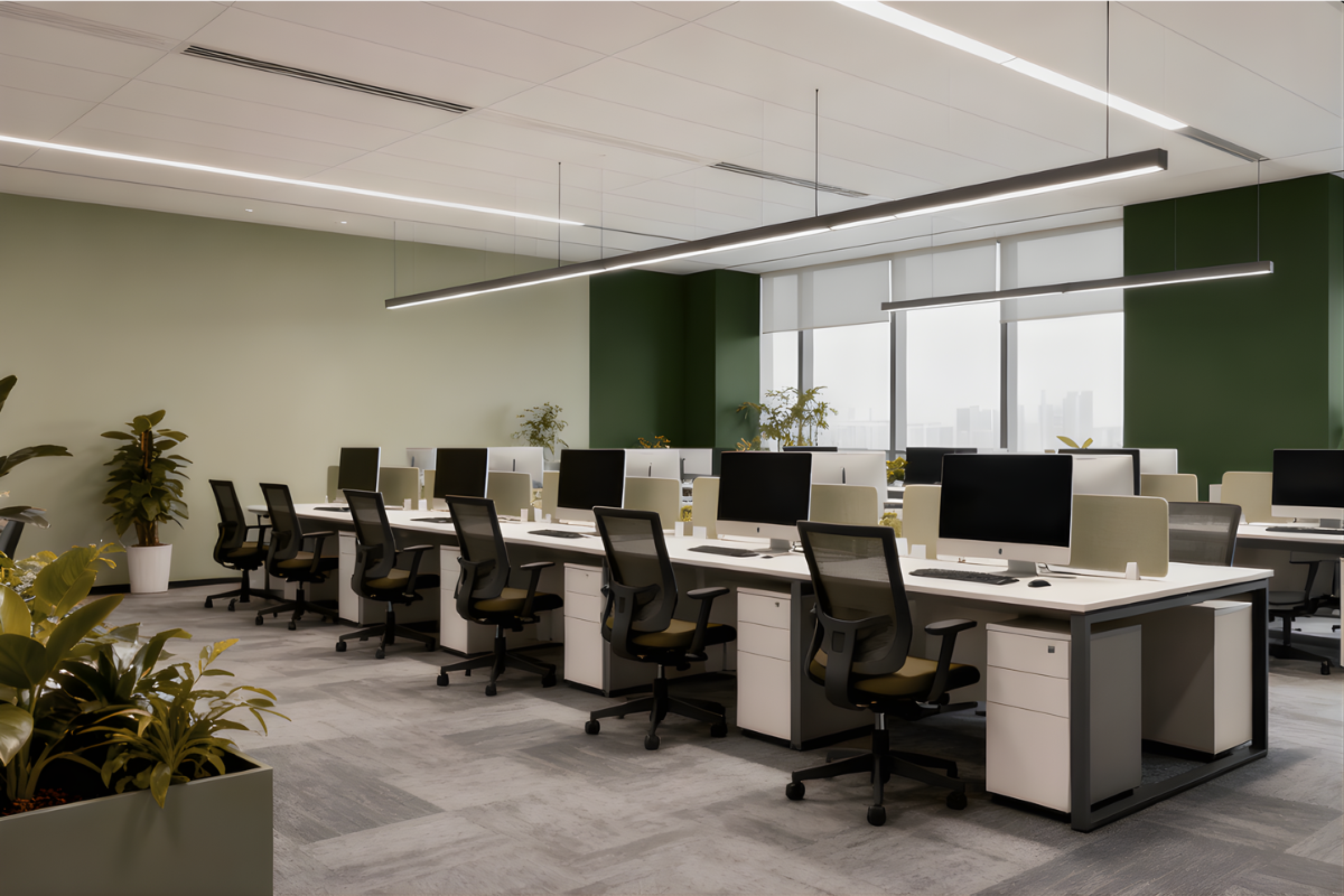
Green is the most versatile office color because it naturally reduces stress while keeping people alert. It's the easiest color for our eyes to process, making it perfect for environments where people spend long hours on computers.
Best for these spaces:
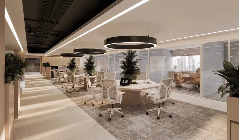
- Open office areas where stress management is crucial
- Collaboration zones for calm, productive discussions
- Break rooms for relaxation and restoration
- Any area with extensive screen time
- Spaces where people work long hours
How to use it: Sage and soft greens work beautifully in large areas. Forest greens convey stability and growth. Green works well as both accent colors and larger wall treatments without being overwhelming.
Red: The Energy Activator
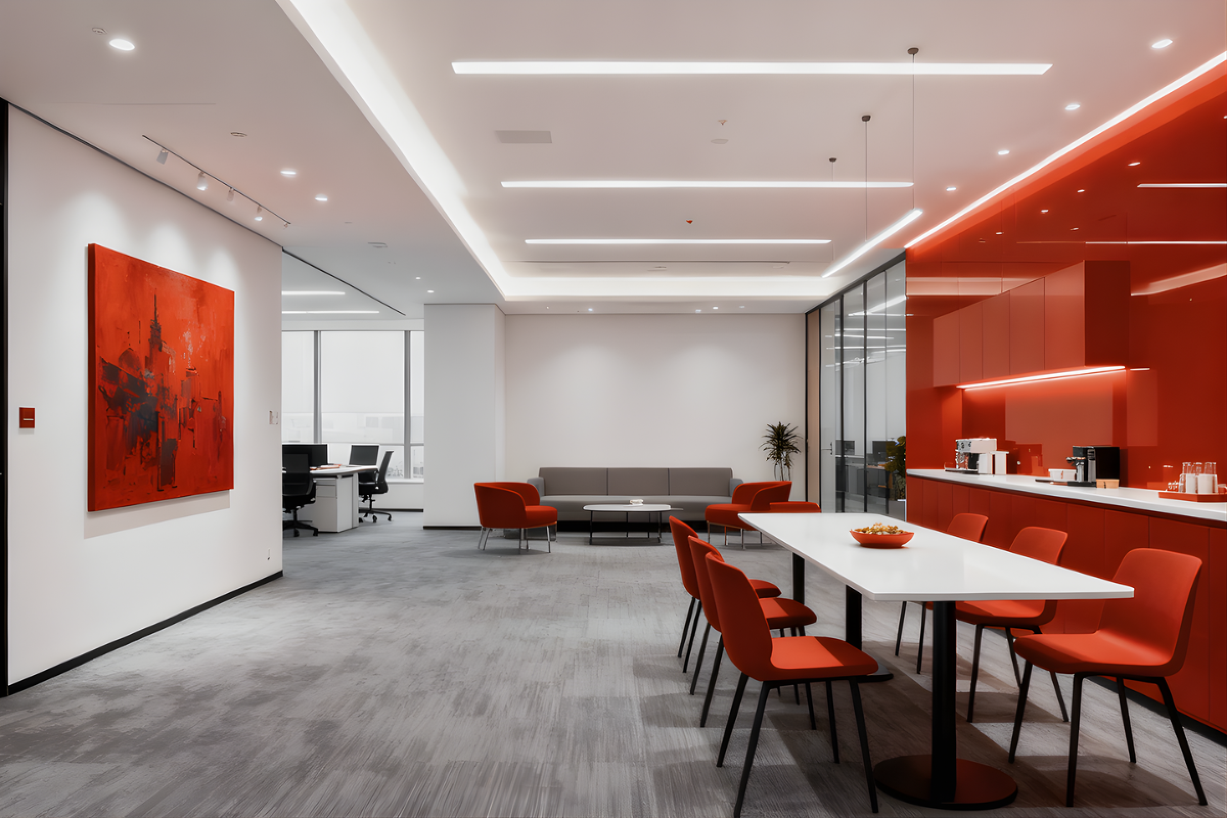
Red increases heart rate and creates urgency. It's powerful for spurring action and energy, but it needs to be used carefully because too much can increase stress and even aggression.
Best for these spaces:
- Break rooms to encourage dynamic interaction
- Sales departments to energize teams
- Informal meeting areas for brainstorming
- Workout or wellness rooms
- Areas where quick decisions are needed
How to use it: Use red sparingly—in artwork, accent pieces, or single feature walls. Avoid using red in spaces where people need to concentrate for long periods or in high-stress departments.
Yellow: The Creativity Catalyst
Yellow stimulates mental activity and promotes creative thinking. It's excellent for innovation and problem-solving, but bright yellows can cause eye strain if overused.
Best for these spaces:
- Brainstorming rooms
- Design studios and creative departments
- Innovation labs
- Strategic planning areas
- Spaces where teams solve complex problems
How to use it: Choose soft, warm yellows like butter cream or pale gold rather than bright sunshine yellow. Use yellow as an accent color in furniture or artwork rather than covering entire walls.
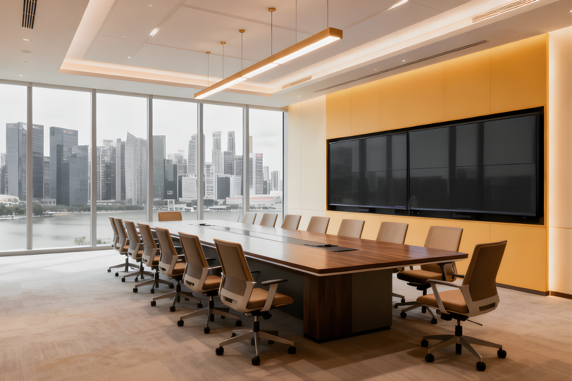
Purple: The Inspiration Generator
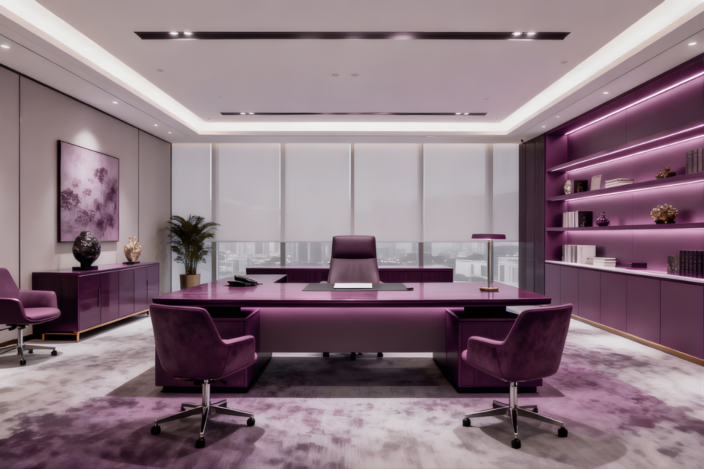
Purple stimulates imagination while conveying sophistication. It's associated with creativity, luxury, and innovative thinking.
Best for these spaces:
- Creative meeting rooms
- Executive offices for big-picture thinking
- Design firms and consulting companies
- Innovation centers
- Spaces where premium services are discussed
How to use it: Lavender and soft purples create inspiring yet calming environments. Deeper purples convey luxury. Use purple strategically in spaces where creative thinking is important, typically as accent colors.
Orange: The Social Connector
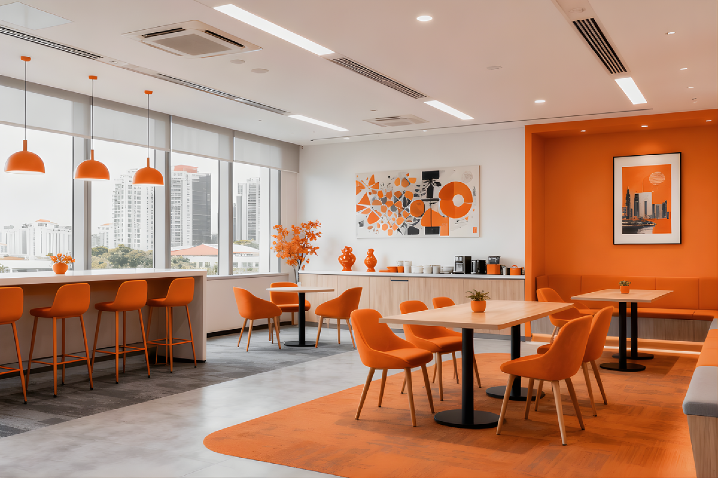
Orange combines energy with optimism, promoting enthusiasm and social interaction. It's particularly valuable for team collaboration and communication.
Best for these spaces:
- Break rooms and cafeterias
- Informal meeting areas
- Team collaboration zones
- Social spaces and lounges
- Areas where you want to encourage friendly interaction
How to use it: Orange can be overwhelming in large doses, so use it as an accent color in furniture, artwork, or decorative elements rather than painting entire walls.
Smart Color Combinations
The most sophisticated offices use neutral foundations with strategic color accents:
Neutral Base + Blue Accents: Perfect for professional environments that need to project competence while supporting focused work.
Neutral Base + Green Accents: Ideal for high-stress environments or offices with lots of screen time.
Neutral Base + Multiple Strategic Colors: Use blue in focus areas, green in relaxation zones, and yellow in creative spaces for maximum psychological benefit.
Department-Specific Strategies
Finance & Accounting:
- Primary: Blue for enhanced focus on detailed work
- Secondary: Small amounts of green to reduce stress
Creative Teams:
- Primary: Yellow and purple accents for innovation
- Secondary: Green for calm focus during detailed work
Sales & Marketing:
- Primary: Orange and red elements for energy and enthusiasm
- Secondary: Blue for strategic thinking sessions
Human Resources:
- Primary: Green and soft blue for approachable professionalism
- Secondary: Warm neutrals for comfort during sensitive conversations
Practical Implementation Tips
Start Small: Test colors with removable elements like artwork, furniture, or accessories before committing to paint.
Consider Lighting: Colors look different under various lighting conditions. Test samples under your actual office lighting.
Think Cultural Context: In Singapore's multicultural environment, consider how different cultures view colors. Red, for example, is particularly positive in Chinese culture.
Avoid Overwhelming: Use the 60-30-10 rule: 60% neutral base, 30% secondary color, 10% accent color.
Plan for Longevity: Choose colors that align with your long-term brand rather than current trends.
Measuring Success
Pay attention to changes in your team after implementing new colors:
- Are people more collaborative in green-accented meeting rooms?
- Do staff seem more energized in areas with warm accents?
- Are there fewer complaints about eye strain in green-enhanced computer work areas?
Common Mistakes to Avoid
Too Much of One Color: Even positive colors become overwhelming when overused.
Ignoring Function: Don't choose colors just because they look good—consider what work happens in each space.
Following Trends Blindly: Choose colors that support your team's actual work rather than what's currently popular.
Forgetting About Balance: Every color scheme needs neutral areas where eyes can rest.
The Bottom Line
Color psychology in office design isn't about creating rainbow workplaces—it's about making strategic choices that support your team's performance and wellbeing. When done thoughtfully, the right colors can boost productivity, reduce stress, enhance creativity, and even improve employee satisfaction.
The key is understanding what work happens in each space and choosing colors that support those activities. A small investment in strategic color choices can yield significant returns in employee performance and workplace satisfaction.


.svg)

%201.webp)